Understanding precision agriculture.
THE IMPORTANCE OF MULTI-YEAR YIELD DATA
THIS ARTICLE IS the second in a series intended to introduce and explain the concept of management zones, to provide a process to define, delineate, and characterize management zones, and to outline the kinds of data and computer tools needed to be successful. The data requirements for creating and characterizing management zones were discussed in the first article, which appeared in the February issue of the Ontario Grain Farmer magazine.

This article will focus on yield data as the first step towards creating reliable, repeatable management zones that will remain relevant over a long period of time. The goal is to use high quality yield data to generate a multi-year yield map, also known as a yield pattern stability map. Alternative data layer options (for example, ortho and satellite imagery, topography, and NDVI maps), which can be used to replace or complement yield maps, will be discussed in future articles.
Yield mapping is the collection and storage of measured yield data points using a calibrated GPS enabled yield monitor. Following harvest, the raw data is transferred to mapping software for processing and the creation of yield maps. This data processing includes the removal of “bad” data. Bad data is created when starting into and leaving a harvest swath, and stopping and starting within the swath as the augers are filling or emptying.
An individual yield map shows the variation of absolute yield (bu/ac, T/ha) within the field for a given year. Yield maps must be “normalized” so that they can be used to create the yield pattern stability map. The comparisons can be made in the yield patterns within and between crops over several years.
The yield pattern stability map shows where yields are consistently above or below the field average. Areas of average yields are those points within a field where yields flip flop between above and below average primarily because of the seasonal variation in weather. One or more years of normalized yield maps are used to construct the yield pattern stability map. It is strongly recommended that at least three years of yield data for each crop be used to make this map.
There are two reasons for using several years of yield maps. One is to check that there is a yield pattern that more or less repeats itself over several years. The second is to check if the yield pattern varies by crop type. It has been observed, for example, that soybean pattern maps may be the reverse of corn pattern maps.
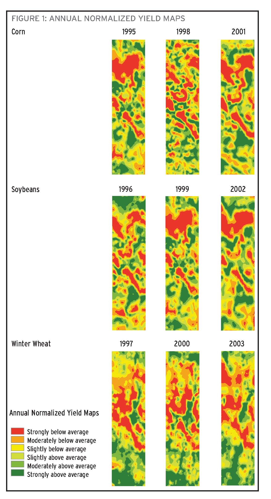
Nine years of annual normalized yield maps (1995-2003) are shown in Figure 1 (below) for a 28 acre field located in Middlesex County. The crop rotation was corn–soybean–winter wheat — all of which were planted no-till. There are three years of yield data for each crop. The green shades in the maps show where the yields are above average while the red and yellow shades show where the yields are below average. Specifically, dark green areas are those areas where the yields were highest and the red areas are those where the yields were lowest.
MAPPING
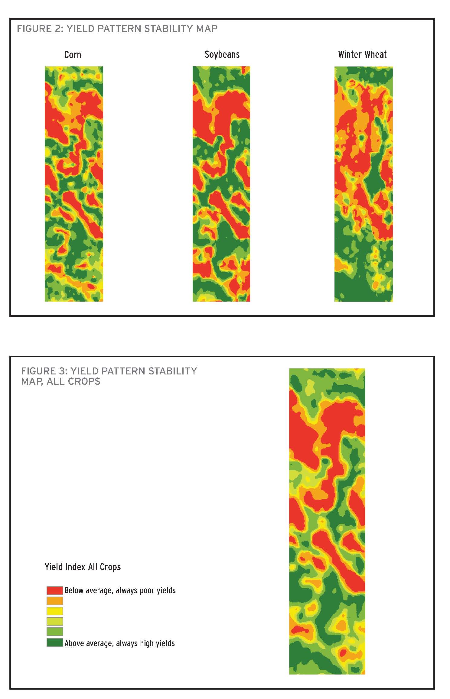
The next step is to create a yield pattern stability map for each individual crop (Figure 2) and then for all crops (Figure 3). The mapping software will have tools for combining the individual normalized maps. Once the individual years are combined into a yield pattern stability map, the consistency across the years becomes apparent. Note that the pattern between corn and soybeans on this field is quite similar, but the wheat is different. The red zones are consistently the lowest yielding areas; whereas, the dark green zones are the consistently high yielding areas in the field. The average yielding areas (yellows and light green zones) are more inconsistent and generally occupy the mid-slope positions within this field. In dry years, these areas will result in below average yields, while in good years the above average yields will move into the mid and upper slope positions.
INTERPRETATION
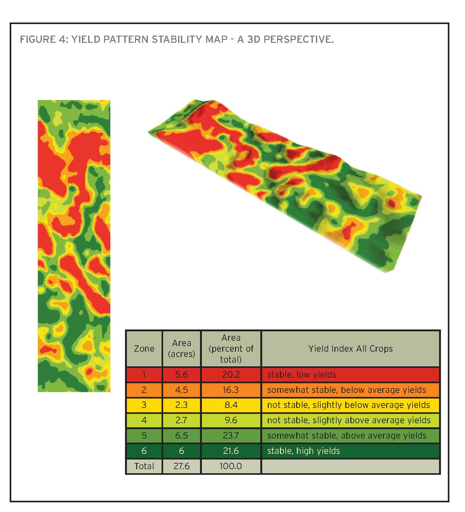
The interpretation of the yield patterns is enhanced by overlaying the map on topography. Figure 4 shows the yield stability map with a 3D perspective. Notice that yield patterns for each crop are strongly correlated with topography. This 3D version of the maps emphasizes that the corn and soybean maps are similar and the wheat is slightly different. Since the yield stability maps are different between crops, separate management zones could potentially be developed for each crop type.
The reason the management zone positions change between crop types is linked to landscape, soil moisture, and soil texture. In this field, the wheat yield pattern stability map shows the low yielding areas (red zones) are associated with the droughty, sandy soils located on knolls.
Sometimes unintended outcomes occur that impact management zones defined by the mapping process. An example of this is that soybeans growing in productive areas (stable, high yielding areas) are more susceptible to white mould because of lush canopy conditions.
The yield pattern stability map when used to create reliable management zones can be an effective tool for making agronomic decisions. For example, you can use it to develop a soil sampling strategy, or as the basis for determining yield goals for the purpose of making fertilizer recommendations.
The use of yield data and the yield pattern stability map will be explored more in future articles. In the next article, collecting elevation data to produce a topographical map and the influences of the landscape on yield and crop performance will be explained.
RESEARCH UPDATE
Grain Farmers of Ontario has partnered with the Ontario Ministry of Agriculture, Food, and Rural Affairs (OMAFRA), Niagara College, and industry partners to develop best practices for precision agriculture.
Year one of the four-year research project is underway. In the fall of 2014, soil sampling was conducted and field boundaries were established for each of the 20 corn and soybean fields being used in the study. This March, OMAFRA researchers are working with certified crop advisors (CCAs) to create management zones and prescription maps for each field. Farmers will be consulted during this process to make sure that their management goals are being met. The prescriptions will involve variable rate seeding, as well as the site specific application of inputs such as nitrogen, phosphorus (P), and potassium (K). Part of each field will be used as a validation plot so researchers can examine whether the right rates were used given the ground conditions and yield potential in each management zone.
More information on this project and other precision agriculture resources are available online at ww.gfo.ca/research.
This project is funded in part through Growing Forward 2 (GF2), a federal-provincial-territorial initiative. The Agricultural Adaptation Council assists in the delivery of GF2 in Ontario. •